How many people are there visualizing the data by the Alteryx Designer? Generally speaking, many people visualize the data by BI tool, probably Tableau or Power BI. However, if you use a BI tool, you need an environment to share the dashboard. So, if you use a BI tool personally, it is difficult to share the dashboard with your team members.
If you use the Interactive Chart tool in the Alteryx instead of the BI tools, some people may find it difficult to use compared to BI tools.
For this people, I would like to explain the order of the data for the Interactive Chart tool.
The behavior of the Interactive Chart tool varies depending on the data type
When you use the Interactive Chart tool, do you feel a bit complex about that’s behavior? In fact, the behavior is changed by the data type.
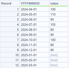
For example, let’s create a time series graph that has month for x axis and value for y axis. Basically, you usually have the month column as Date type, let’s use it. The data is as follows, however there is no value after Janually, 2025.
The graph based on above is as follows.

However, x axis value is automatically shown as month name if you want it or not.
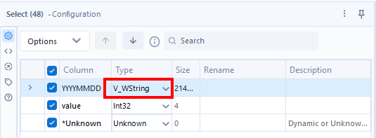
Next I would like to change the data type from Date to String.
The graph is as follows.

There is no change. Why the month value is shown as month name? I think when the data can be handled as date type despite of the String type, the Designer automatically handle it as date type.
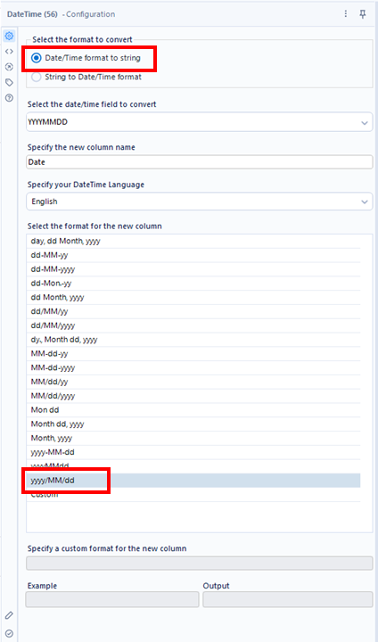
Third, I change the date to YYYY/MM/DD format. In Japan, this format is generally used.
The graph is as follows.

The date columns is literally shown. This result is what I expected.
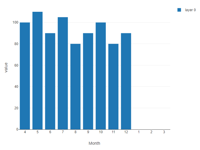
Fourth, I would like to change the data to Month number.
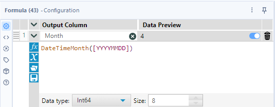
The graph is as follows.

Due to changing to the numeric type, the order is numeric ascending order.
Fifth, I would like to change the data type to string.
This is what I want.
What happen if there is a missing period
There is a missing period from December 2023 to April 2024 in the data.
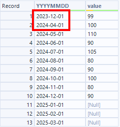
The graph based on the above is as follows. Note that YYYYMMDD field is Date type.

The missing period is positioned with spaces as I expect.
On the other hand, if the date column is date type, what happen?

The missing periods are placed in record order with no spaces.
Conclusion
- When numeric or datetime data types are used as axes, the data is sorted numerically or datetime-wise and displayed on the graph.
- For string data types, no sorting occurs; the graph is created in the order of the data.
- When Datetime/Date data is converted to text, missing periods are filled in (according to the data order). For Datetime/Date data types, missing periods are displayed as null.
- Datetime data types are automatically recognized as Datetime/Date data types when using the standard Alteryx format.
- The behavior is differ in data formats, which confuse us.
Sampleworkflow Download
The next blog post will be…
The next blog post is about new option for JSON Parse tool.

コメント