In the Weekly challenge “Challenge #385: Volcanoes in 2023“, most people splited the data stream for each style. But you can use one data stream to divide and represent each category. I would like to explain how you can do it.
Input data and expected output
This sample data is that I put some points randomly in Las Vegas where the Alteryx event “Inspire” takes place.
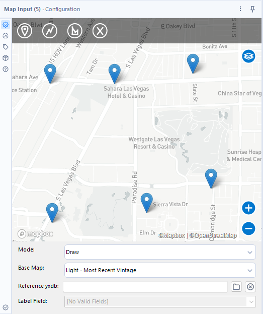
Each one is labeled. It is labeled 1, 2, or 3…. In this case, let’s change the color and shape depending on the label number.
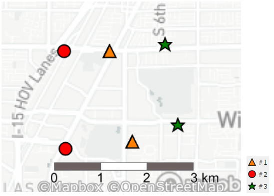
Note the expected output is as follows.
A standard way to change the style depending on the label using the Report Map tool.
First, let’s do the standard way to learn the Report Map tool.
The standard way is that you split the data stream into the each label using the Filter tool before the Report Map tool because you can set the different style depending on the different data stream.
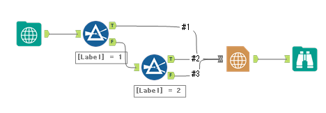
Now let’s see the detail of the Report Map tool. To apply the different style for each data stream, open the Report Map setting and then click on the “+” button on the Layers tab and select the each data input in the Point Layer. By this operation, each input are added as point layer.
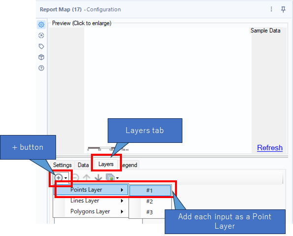
And then, set the style for added layers.
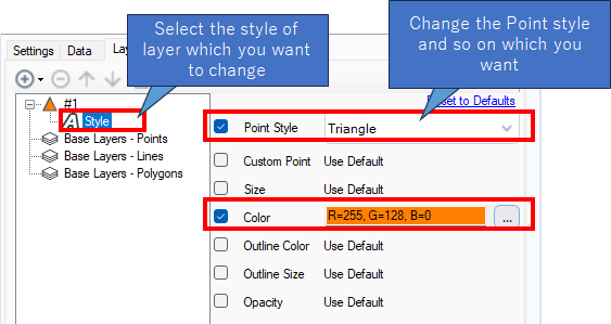
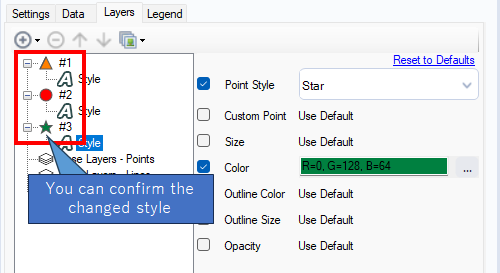
For our purpose, if you change the style for each label, it will look like the following. When you change the style, the shape of the left icon changes.
This way is easy to understand. However, when there are many labels, you need to add much more the Filter tools. In that case, the workflow will be messy.
Use Thematic Field and color method for the simple workflow
So, I would like to explain more simple way.
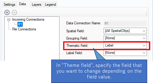
Input is only one. And move to the Report Map tool’s setting. And then, you need to specify the field to distinguish the style at the “Thematic Field “on the “Data” tab. In other words, you need to specify “Label” field at the “Thematic Field”.
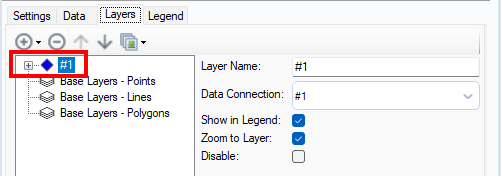
After that, move to the Layers tab, add #1 as the point layer by using “+” button.
Next, select the “Theme” at the #1 which you made and then set as follows.
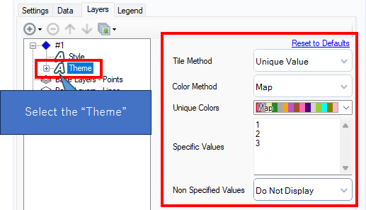
- Tile Method : Unique Value
- Color Method : Map
About the “Specific Values”, there are the values 1, 2 and 3 in the “Label” field so you need to set those values in “Specific Values”. “Unique Colors” and “Non Specified Values” options are acceptable any setting.
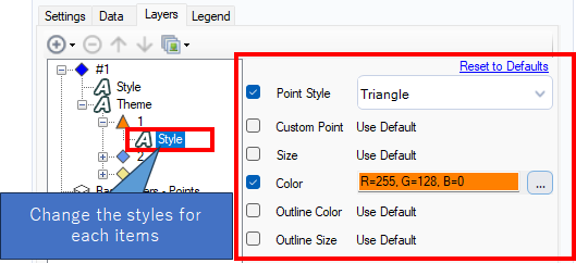
After that, you need to change the specific color and shape. First is for the Label 1.
Second, this is for the Label 2.
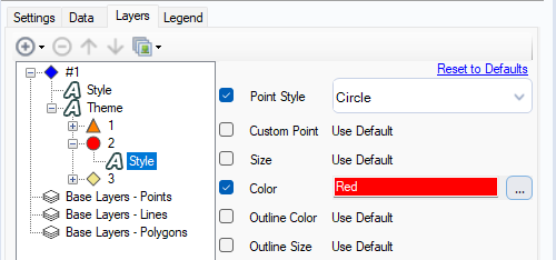
Last, this is for the Label 3.
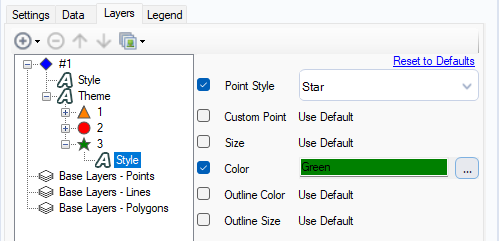
Note that there is also a “Style” at the top (directly under #1), but if you specify everything except color here, the same style will be applied to all items. Also, basically lower setting are used with priority.
Summary
I explained how to change the style depending on the field value using “Thematic Field” and “Tile Method : Unique Value”. And when you want to change the style depending on the value range, you can use another option.
The Report Map tool have wide expression so try experimenting with it.
Sample workflow download
Contents of the next blog
The next blog post will be about Map tools, too.

コメント